
Great product photos sell your pieces before you ever say hello. The good news? You can get crisp, color‑true shots with the phone already in your pocket. Here’s a friendly, fast guide to lighting, angles, styling, and editing—without a studio budget.
1) Simple Gear Checklist
- Your phone (clean the lens!)
- Table near a bright window
- Two white foam boards (reflectors) and a sheet of white printer paper (diffuser)
- Neutral background: matte white, slate, linen, or light wood
- Small phone tripod or stack of books + timer/remote
- Microfiber cloth, painter’s tape, a lint roller, and a soft brush
2) Easy Lighting Setups
Window light (45°) — Place your setup next to a bright window. Put the piece on a matte surface, window to one side, white foam board on the opposite side to bounce light. If light is harsh, tape thin white paper over the window as a diffuser.
Light tent vibe — Build a quick “tent” with two foam boards forming a V behind the product and a sheet of paper on top. Add a desk lamp from the front, slightly above eye level. Bounce with the second board.
Backlight for sparkle — Put a light behind and slightly above the piece (diffused) and bounce from the front with white card to bring back detail. Gorgeous for faceted stones and crystals.
Avoid: mixed light sources (warm lamp + cool window) which cause weird color casts.
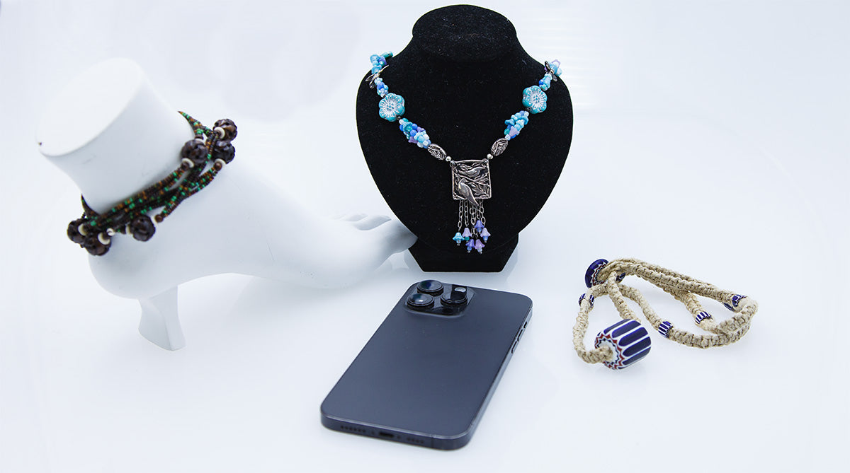
3) Composition & Angles
- Hero + detail: Capture one clean straight‑on hero, one angled hero, and 2–3 tight details.
- Scale: Include a hand/model or a simple ruler shot (clean nails, neutral styling).
- Eyes like triangles: Create a tall‑short‑short triangle with props for balance.
- Reflections: Angle shiny metal 5–10° off flat so it reflects your white bounce, not your phone.
4) Backgrounds & Styling
- Keep it simple—two textures max (e.g., linen + wood). Product is the star.
- Stick to your brand palette; use the same background family across shoots.
- Use museum putty or tiny tape loops to steady pieces; clone out in editing if visible.
5) Phone Camera Settings
- Tap to focus and use AE/AF lock (long‑press) so the exposure doesn’t drift.
- Slide your exposure slightly down to protect highlights on metal and gems.
- Use the phone’s 2× (optical) if available—less distortion for small items.
- Turn off flashy filters; aim for neutral, color‑accurate files.
- Use a timer or remote to avoid shake; shoot a short burst and pick the sharpest.
6) Quick Editing Workflow
- Crop to your store’s aspect ratio (1:1 squares or 4:5 verticals are great for product pages).
- White balance to remove color casts; use something neutral in frame as a reference.
- Adjust exposure, contrast, and clarity gently; avoid crunchy sharpening.
- Remove dust specks and tape with the healing/retouch tool.
- Export at a generous web size (e.g., ~2000 px on the long edge) for crisp zooms.
7) Consistency for Your Brand
- Create a shot list and reuse it: hero, alt angle, clasp detail, scale, lifestyle.
- Use the same backgrounds, angles, and lighting for each collection.
- Name files consistently (e.g.,
collection_style_color_01.jpg).
Troubleshooting & Shine Control
- Harsh glare? Move the light higher and farther, or add diffusion.
- Flat, dull look? Add a small backlight and bounce from the front.
- Too warm/cool? Turn off mixed lights; re‑balance white point.
- Soft images? Use a tripod/stack of books + timer; clean the lens again.